CASE Study
Design system for a
suite of SaaS products
Defined the architecture and rollout strategy for a shared design system across a suite of legacy SaaS products with different technologies and product teams. The goal was to establish reusable web UX patterns, improve cross-product coherence, and create a scalable foundation for gradual product alignment.
My role
Manager/Director of Product Design
- Design system strategy
- Design system architecture
- Workflow and governance design
- Design tokens and variables
- Component architecture
- Design-engineering collaboration
- Team enablement
Why the system was needed
The products had evolved independently, resulting in different visual and interaction patterns across the suite. Production and Figma occasionally diverged as products evolved across different teams and delivery paths.
As the products were being brought together into one productivity suite, we needed a shared foundation that could make interactions more predictable, improve learnability between products, and create a more coherent experience.
Design system strategy
Rather than redesigning every product at once, I defined a phased strategy: establish shared foundations and reusable interaction patterns first, then migrate product-specific interfaces incrementally as product and engineering capacity allowed.
Key initiatives included:
- defining contribution and review workflows
- establishing component ownership
- defining reusable patterns for cross-product use
- introducing seed-hue-based palettes for multiple products
- documenting standards for designers and engineers
- creating a scalable foundation for future growth
Alternative considered
We evaluated commercial component libraries as a faster starting point. I advocated for a custom system because the suite required significant flexibility across products, and heavily customizing an external library risked creating long-term design and technical debt.
Building our own required more upfront effort, but gave us control over shared patterns, product-specific needs, and future evolution.
Workflow & system infrastructure
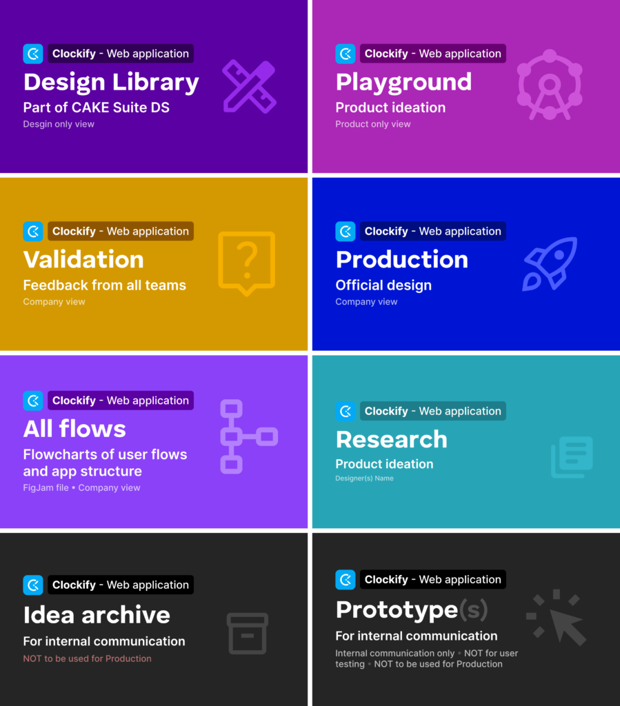
I defined a shared working model around the design system, including library structure, file organization, naming, annotations, contribution practices, and handoff conventions. The goal was to make design work easier to understand across product teams and reduce the cost of designers moving between products or taking over each other’s work.
The infrastructure was designed to enable:
- clear ownership of design assets
- predictable contribution workflows
- faster discovery of reusable resources
- efficient collaboration between multiple product teams
- scalable maintenance as the system evolved
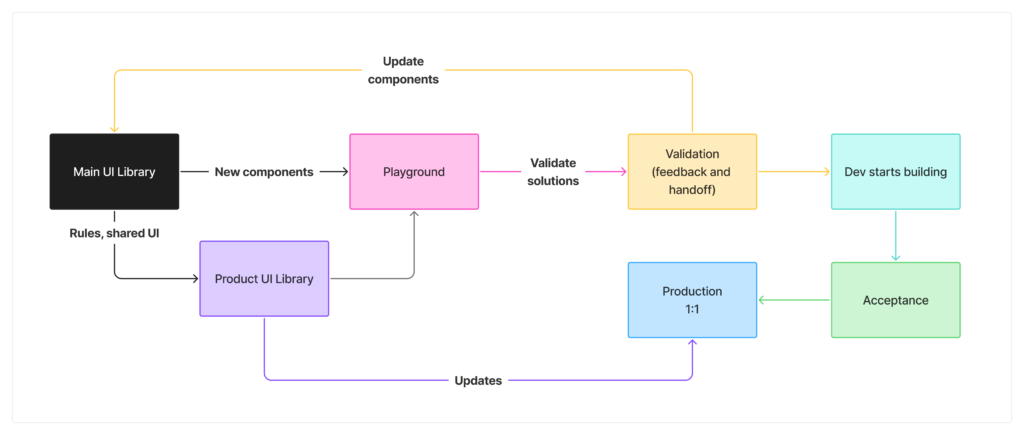
The diagram illustrates the intended product design workflow through shared libraries, documentation, validation, and delivery, designed to support consistency across teams.
Component architecture
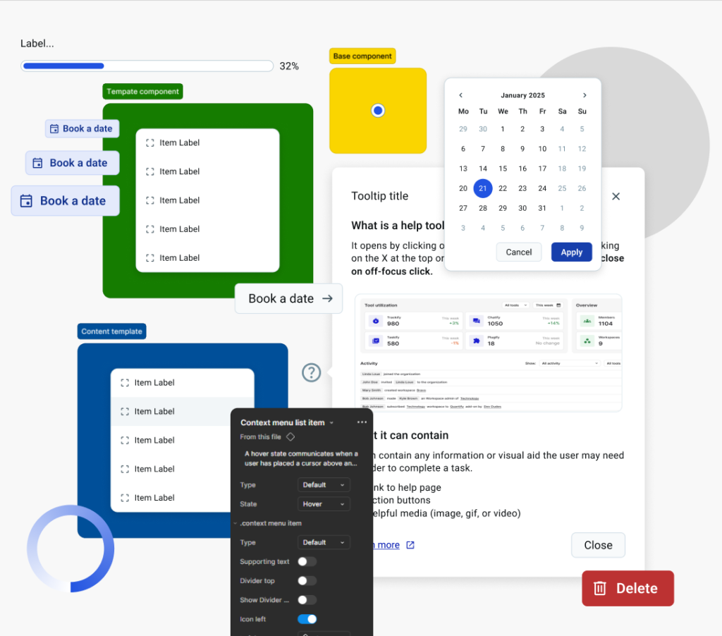
I designed the component architecture to support shared web app UX patterns while accommodating product-specific requirements.
Using variables, variants, and composable building blocks, I reduced unnecessary duplication while allowing products to adapt components to different brands and themes.
The architecture emphasized:
- scalability
- consistency
- maintainability
- performance
- predictable customization
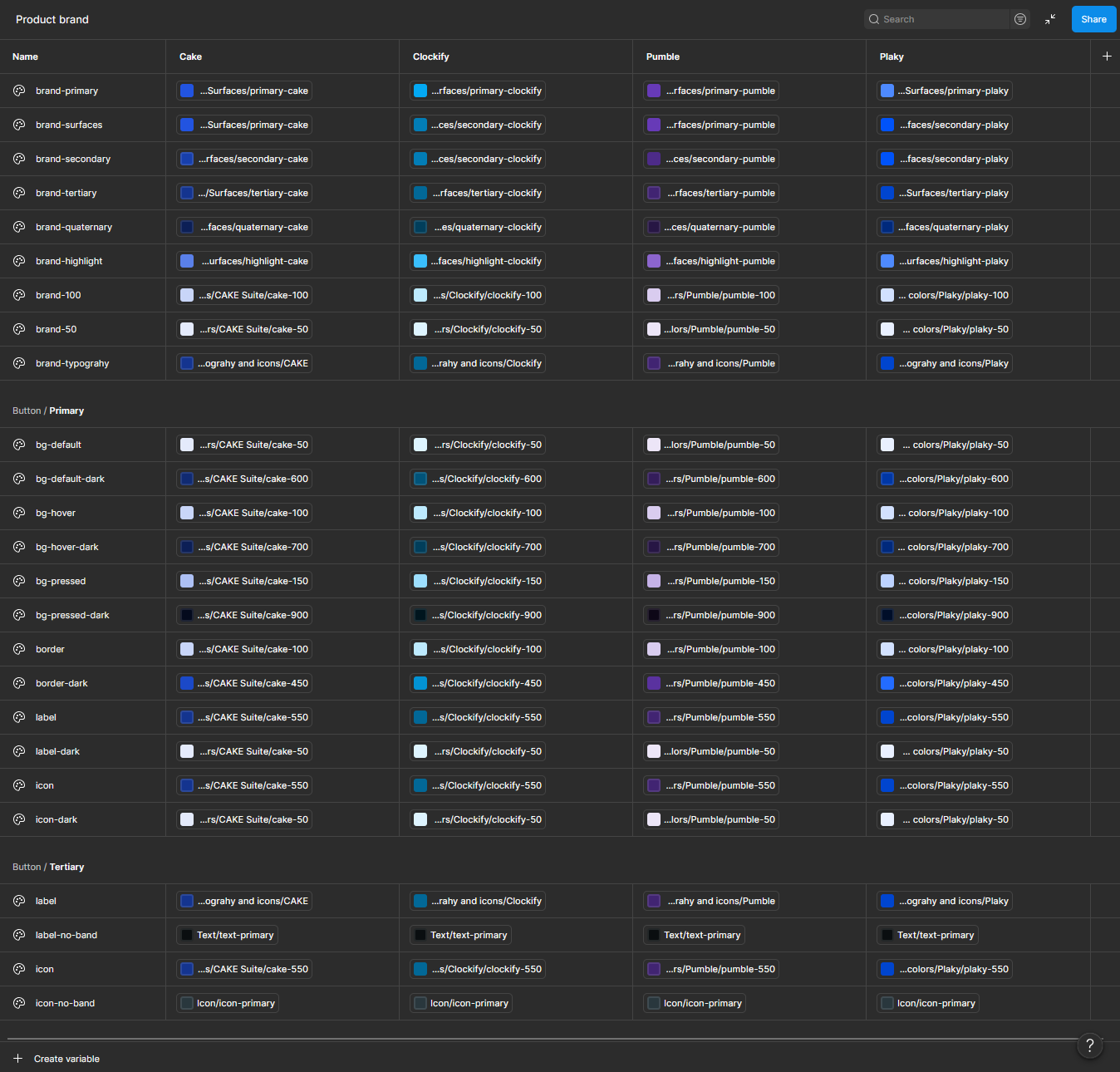
Component collections enabled a multi-brand variable system using semantic modes, allowing brand changes independently of color modes.
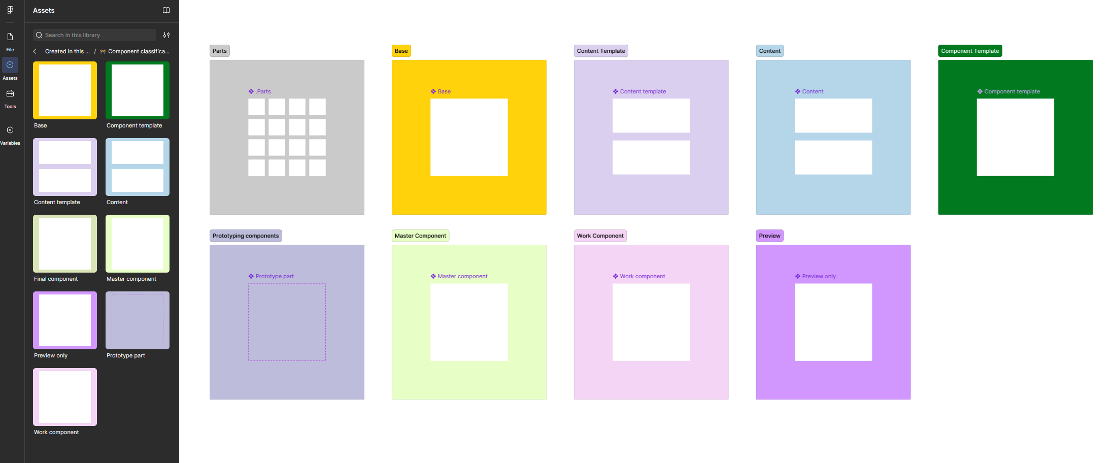
Component classification
As the library expanded, designers increasingly spent time locating the right components rather than designing.
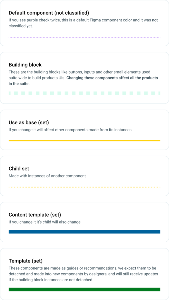
To improve discoverability, I initiated the creation of a classification system based on component purpose rather than visual appearance.
The system combined:
- logical component categories
- color-coded Figma Sections
- reusable templates
- annotation standards
This reduced search time, clarified intended usage, and made onboarding significantly easier for new designers.
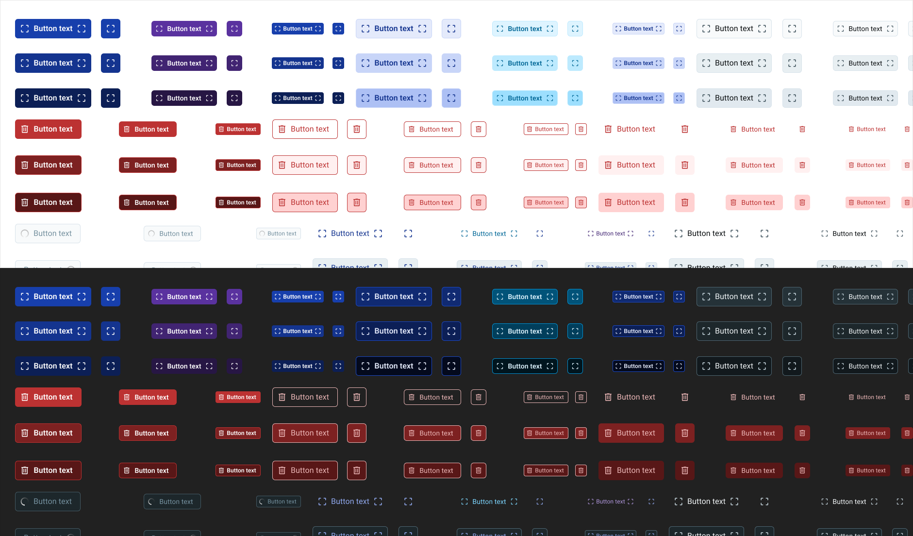
Component Example
Button system
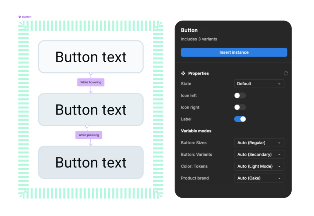
The button system demonstrates the principles used throughout the design system.
Instead of creating hundreds of individual components, behavior was centralized through variables while visual variants remained reusable and composable.
This reduced maintenance while supporting:
- multiple sizes
- nine button styles
- four brands
- light and dark themes
- icon configurations
- accessibility states
Design-engineering collaboration
The design system was established in Figma first, giving Design a shared foundation while frontend implementation matured separately.
Later, a Clockify frontend team built the corresponding Storybook library, and we collaborated on component behavior, variables, accessibility, and rollout planning.
Where legacy behavior could not be aligned immediately, we used temporary frontend themes and migration paths so product delivery could continue without compromising the long-term system direction.
Team enablement & adoption
A design system succeeds only when people use it consistently.
I mentored designers on system thinking, reusable component design, and contribution practices while supporting adoption through documentation, reviews, and day-to-day collaboration.
The goal was not only to create components, but to establish shared ways of working across the organization.
The shared Figma foundation was adopted in active product work across two products, with product-specific libraries built from shared foundations and building blocks. The frontend Storybook library established the implementation path, with broader suite adoption planned as products were redesigned.
System thinking
I treated the design system as product infrastructure rather than a component library.
It combined shared libraries, component architecture, contribution workflows, documentation, and governance to help multiple product teams work consistently while accommodating legacy constraints, different brands, and legitimate product-specific needs.
The approach favored shared patterns where they added value, explicit exceptions where needed, and phased migration rather than forced standardization.
Impact to date
The work established a shared design-system direction, reusable web app patterns, and a common foundation for product teams across the suite. Implementation remains partial, so the strongest impact to date is in design alignment, reuse, and creating a clearer path toward cross-product consistency.
Accessibility considerations were embedded into reusable components and interaction patterns from the start, helping teams account for accessibility earlier in the design process.
The foundation supports teams in:
- reusing shared patterns instead of recreating common UI
- aligning product interfaces around common UX conventions
- improving design-engineering collaboration through shared references and documentation
- onboarding designers into a more consistent file and library structure
- supporting gradual migration toward cross-product consistency
Conclusion
A design system is not finished when the components are built. It requires continuous ownership to remain usable.
Without a fully dedicated design-system team, one of our biggest challenges was maintaining file hygiene, naming conventions, and a predictable asset structure as the system evolved. Small inconsistencies accumulate quickly, making assets harder to discover and navigate when governance is not actively maintained.
Despite limited dedicated capacity, we established a shared foundation that improved consistency across the suite and created a clear path for further adoption.