CASE Study
Design System for Productivity Suite of SaaS Products
I initiated and led the creation of a shared design system to support multiple product teams and products within a SaaS suite. The system focused on improving UI consistency, accelerating design workflows, and creating a shared foundation for collaboration between design and engineering.
My role
Director of Product Design
- Design system initiative and strategy
- Governance and onboarding
- Component architecture and classification standards
- Team alignment and mentorship
Workflow & System Infrastructure
- Designed a network of Figma files and libraries that supports efficient workflows, system maintenance, and resource discovery
- Introduced visual classification and color-coded component sections to help designers quickly identify component types in the asset library
- Structured system documentation and files to support both design implementation and developer reference
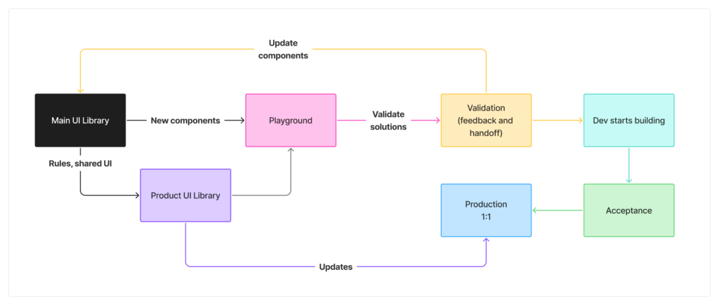
Design System Strategy
- I recognized the need and spearheaded the design system initiative, defining its scope and structure
- Established contribution guidelines and usage standards to ensure consistent adoption across teams
- Introduced component classification and management rules to reduce instance misuse and improve system scalability
- Organized the system architecture with designers and engineers as primary users
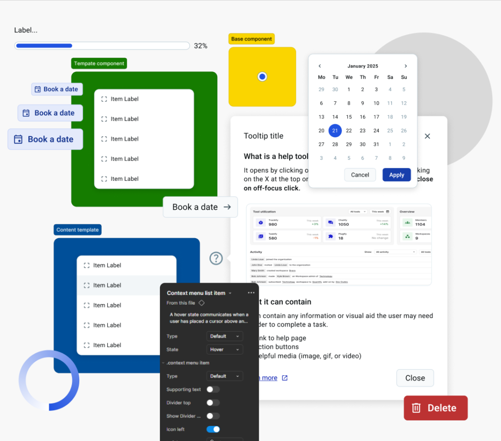
Component Architecture
- Designed flexible, scalable components using Figma variables and variants to reduce component count and improve performance
- Introduced slot-based composition patterns and promoted instance swap usage to increase component flexibility
- Created template components built from reusable building blocks, allowing designers to rapidly assemble UI while maintaining consistency
- Implemented structural patterns that minimize detaching and protect system integrity
Component Classification
After observing how the team works ideas started to appear about how to speed up the process further.
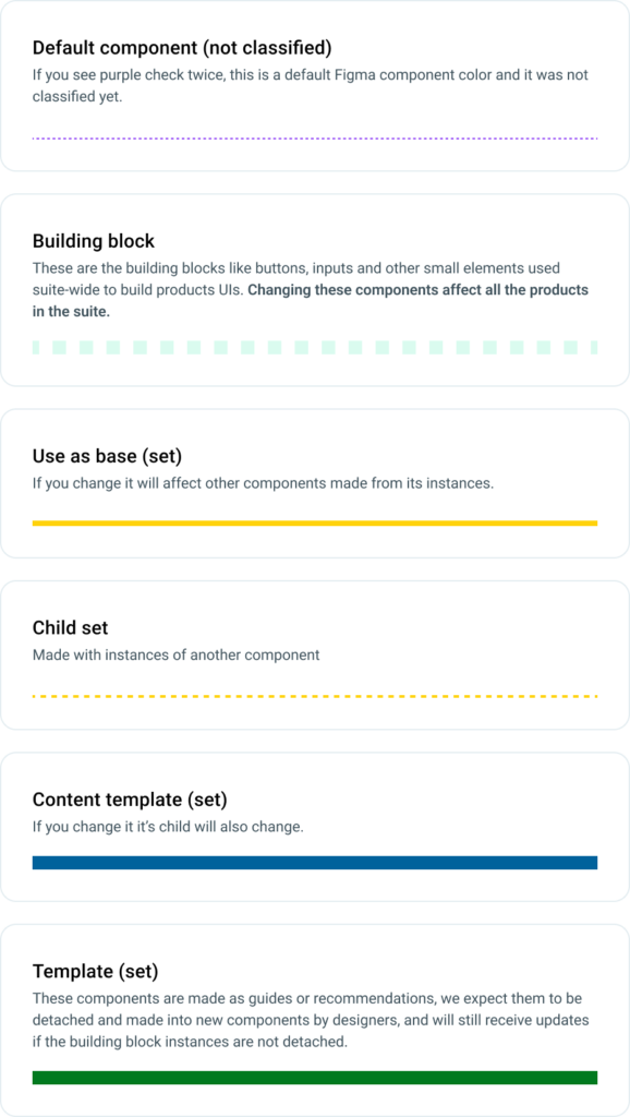
After noticing they spend a fair amount of time looking for components and noticing some unleveraged benefits of Figma Sections I sparked the idea of color coding the components for easy recognition, and from there my team and I came up with a classification that suits the team workflow.
- We defined the component types such as base, content, templates, and more
- We used sections to color code them in the Figma Assets panel for easy identification
- This allows the team to quickly identify components that are building blocks or the ones that are detachable templates
- We set the variables through our custom annotation library for easy access by each team
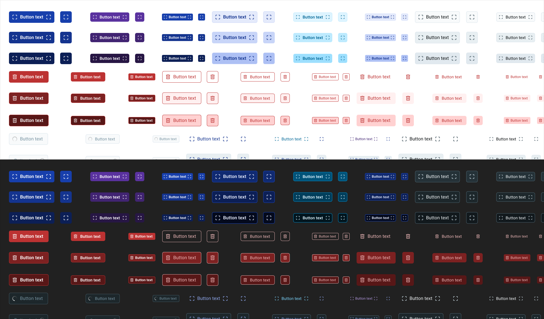
Component Example
Button(s)
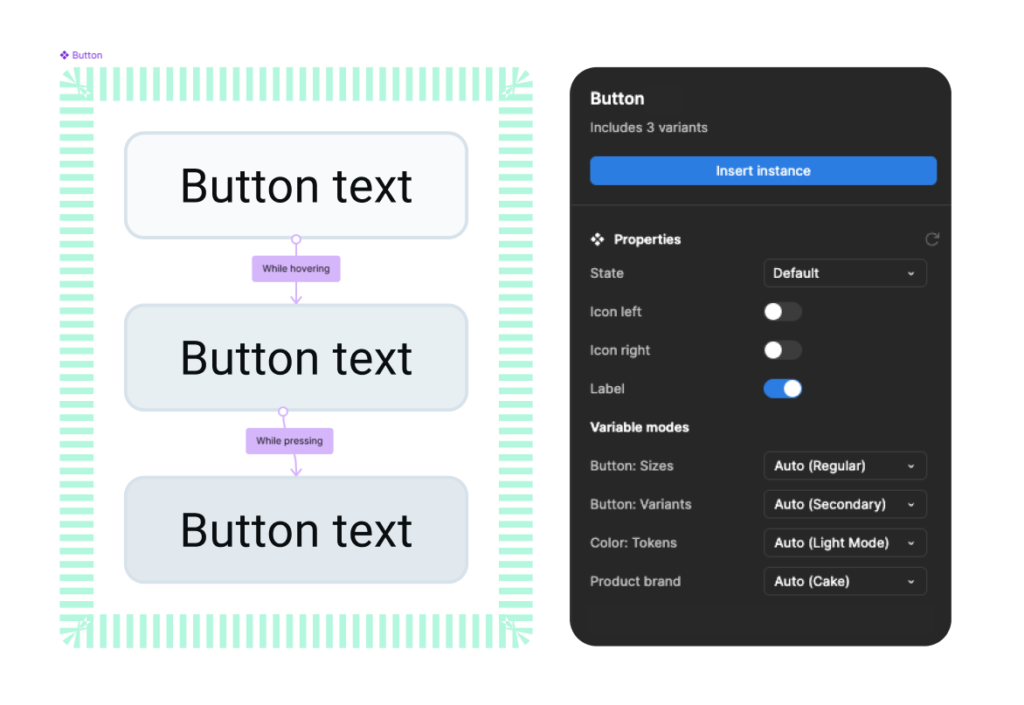
The button set I created for he library contains all the buttons used in the suite.
Component set only holds the state variants and icon postition and label visibility properties, while sizes, button types (both mods), and branding, are all managed through variables, reducing memory usage.
This set contains:
- small, regular, large sizes for all button types
- button with no icons, button with icon leading/trailing, icon button (no label)
- 9 button types
- state styles for each button type
- 4 brands for 3 branded button types
- dark and light mode for each type and brand
Design/Engineering Collaboration
- Led the introduction of the design system UI library to engineering teams
- Initiated early variable alignment
- Enabled engineering to create a corresponding front-end UI library, strengthening alignment between design and implementation
- Used the system as a foundation for improving design–development consistency
Team Enablement & Adoption
- Mentored designers on component creation, system thinking, and Figma best practices
- Introduced new practices such as slotting and structured component composition across the team
- Supported designers while applying the system in real product work to ensure practical adoption
Impact
There were many challenges along the way and still many to solve as the design system and its adoption grows.
The design system established a scalable foundation for product development by:
- enabling designers to work more efficiently while maintaining system standards
- improving cross-product UI and UX consistency
- accelerating design workflows through reusable components and templates
- strengthening collaboration between design and engineering
- speeding up the process of onboarding and orientation of new designers
Accessibility & Quality
- Introduced accessibility considerations as part of the design system foundation
- Promoted accessible patterns through reusable components and design guidelines